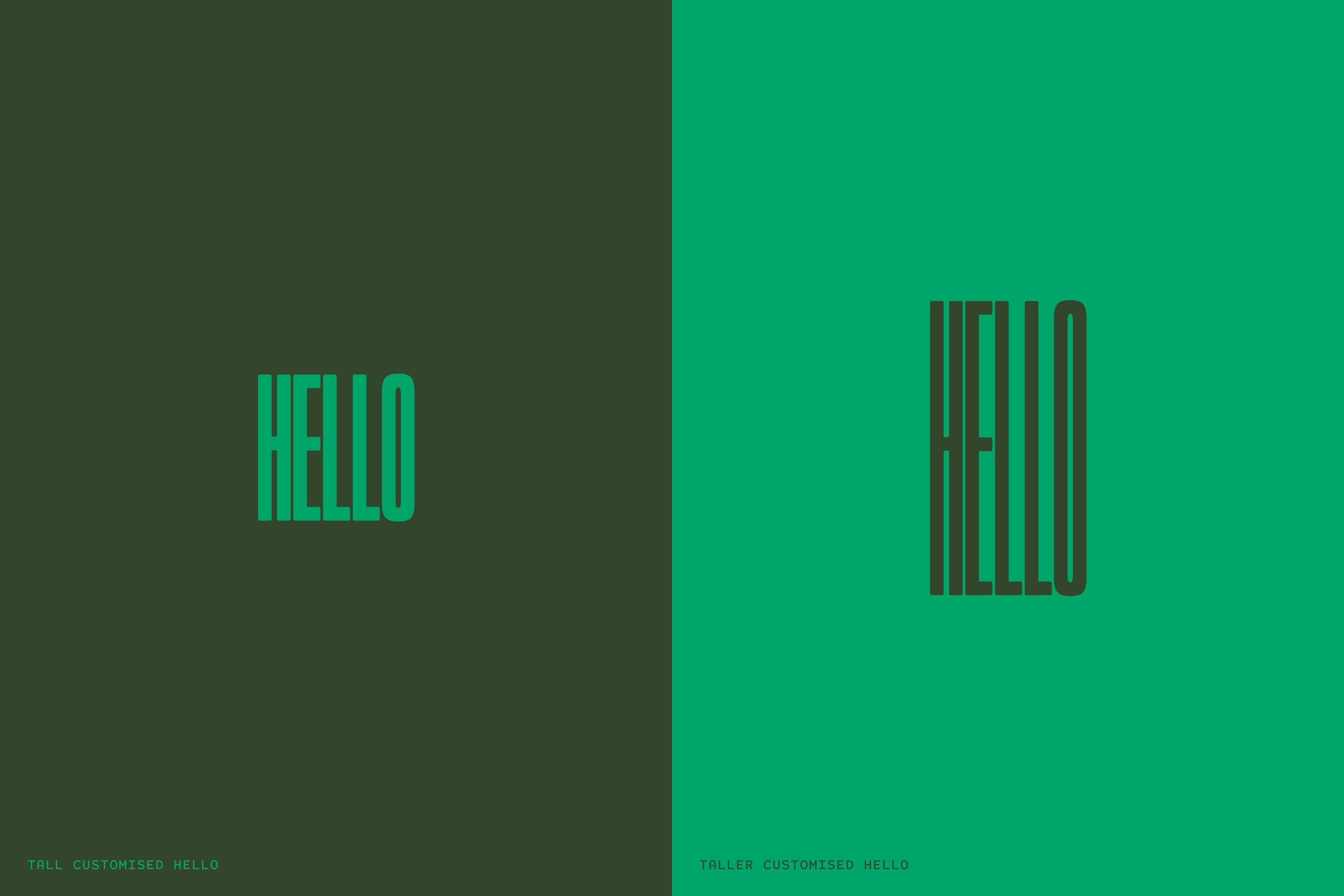
Our design system is giving bold, flavour-forward energy that plays nicely with our dining experience. The brand utilises an interchangeable family of logotypes set in Trio Grotesk, featuring a distinctive "Hello" symbol that appears across various applications, including apparel, collateral, signage, and social media. The colour palette draws inspiration from South Brisbane’s surroundings and vibrant dishes, while the typography combines Trio Grotesk, Items Text, and Media Sans Condensed.
This guide provides assets and examples for using this adaptive system—from quick communications to immersive brand experiences.